Every CTO knows the struggle of managing complex reports. The inefficiency of scattered data, the constant juggling between reporting tools, the challenge of ensuring accurate KPIs and so on makes them frustrating.
Power BI Report Server is designed to help you display reports and manage KPIs efficiently through a simple web portal. You can kick things off with a free trial of Power BI Server but to keep enjoying its awesome and premier features, you need to buy a Power BI Premium License or SQL Server Enterprise with Software Assurance.
Okay, here’s what you need to know about Power BI Report Server.
It’s an on-premises solution used to offer Power BI Reporting services.
It combines the features of Power BI and SSRS in one place.
Demands a Power BI Premium license to use it.
Helps you move from traditional SSRS to the more dynamic Power BI.
In this blog, we'll dive into the latest features of Power BI Report Server from 2023 to 2025. Plus, we'll cover the key elements of Power BI Report Server.
What's New in Power BI Report Server?
Before we get into detail, let’s take a look at the Power BI report server feature summary - from 2023 to 2025:
These updates reflect significant enhancements in modeling, visualizations, data connectivity, and mobile capabilities, making Power BI Report Server more powerful and user-friendly.
Power BI Report Server: 13 Key Features CTOs Should Know
Let's dive into the details of each update and explore what they bring to the table. We'll break down each feature to understand its benefits and how it can enhance your experience with Power BI Report Server.
1. Mobile View Port Improvements
What's it for? - Enhanced Viewing Experience on Mobile Devices.
Ever tried viewing a Power BI report on your phone and felt frustrated? You’re not alone. Power BI Report Server now enhances the mobile view so that reports fit perfectly on any screen.
Responsive Layouts: Automatically adjust based on device size.
Better User Experience: Smooth scrolling and improved visuals.
Faster Navigation: Easily switch between pages without delays.
Now, analyzing your data on the go feels as easy as scrolling through your favorite app!
Take a look at these prime Power BI use cases we've crafted for our industry CTOs. These BI examples helped them simplify their operational decisions!
HealthTech
LegalTech
FinTech
2. Full Screen for PBIX and RDL Viewing
What's it for? - Support for Full-Screen Viewing of PBIX and RDL Files
Think of this as switching from a small TV to a home theatre. With the full-screen mode, you get a clutter-free, immersive view of your PBIX and RDL reports.
No Distractions: Focus only on your data.
Bigger, Better Insights: Analyze data without switching tabs.
Ideal for Presentations: Perfect for meetings where you need undivided attention.
Whether you’re showcasing reports in a boardroom or analyzing them solo, full-screen viewing takes your experience to the next level.
What's it for? - Ability to Switch Between Different Mobile Layouts
Why settle for a one-size-fits-all approach? Power BI now lets you switch between different mobile layouts with ease.
Grid View or Tabular? Choose the layout that suits your analysis.
Custom Layouts: Design layouts for different devices.
Quick Toggle Option: Instantly switch between views for better insights.
This makes it easier to tailor reports for your mobile audience.
4. Shapefile Support in Azure Maps Visual
What's it for? - Expansion of Spatial Data Integration
Imagine trying to map out delivery routes without showing exact boundaries — confusing, right? Now, Shapefile support in Azure Maps Visual solves that.
Better Geospatial Analysis: Plot locations with accurate boundaries.
Custom Map Layers: Add region-specific boundaries for better insights.
Ideal for Logistics and Supply Chain Reports: Map routes, coverage areas, and more.
This feature helps you make location-based decisions with precision.
11. Performance Improvements for Models with Calculation Groups
What's it for? –Enhanced Performance for Complex Models.
Have you ever felt your model slowing down with too many calculations? Power BI now boosts performance for models using calculation groups.
Faster Processing: Handle complex models without lag.
Improved Scalability: Ideal for large enterprise-level datasets.
Better Memory Management: Optimized for high-efficiency processing.
Now, even the most complex models perform smoothly.
12. New Visuals in AppSource
What's it for? -Addition of New Visuals Like Date Picker, Cycle Plot, and Decomposition Tree.
Imagine adding fresh tools to your toolbox — that’s what these new visuals in AppSource do for your reports.
Date Picker: Simplifies time-based filtering.
Cycle Plot: Reveals seasonality in data.
Decomposition Tree: Breaks down complex hierarchies visually.
These visuals offer more ways to make your reports insightful and engaging.
Our Power BI Templates
(Turning insights into various data visualizations)
Step Area Chart
Our Step Chart visualization built with Power BI provides a simple way to grasp complex time-related data, enabling faster, data-driven decision-making.
Why is it worth using?
Helps identify trends 40% more accurately.
Cuts analysis time by 25%.
Highly customizable.
Popular among over 250,000 professionals.
Speeds up data-driven decisions in Fortune 500 companies.
Pie Chart
This personalized pie chart brings data to life with labeled sections, vibrant colors, and interactive tooltips. Click on slices to explore details and filter insights effortlessly!
Why is it worth using?
Clear category representation.
Adaptable dynamic data.
Highly customizable.
Highlighting specific data points.
40% trend identification improvement.
25% analysis time reduction.
Bump Chart
Track ranking changes over time with our Bump Chart for Power BI. Gain clear insights into performance dynamics and compare entities effortlessly!
Why is it worth using?
Gain clarity on performance shifts over time.
Customized colors, and tooltips to fit your needs.
Ideal for data analysts, business leaders, and financial planners.
Make smarter decisions with trend insights.
Track rankings effortlessly for action.
13. Power BI Mobile Apps Update
What's it for? -Mobile Apps Will No Longer Connect to Report Server Using OAuth and AD FS 2016.
Wondering if your mobile app will still work after this update? Here’s the catch — Power BI mobile apps will no longer use OAuth and AD FS 2016 for connecting to Report Server.
Why the Change? To improve security and connectivity.
What You Need to Do: Reconfigure connections to comply with the new standards.
Future-Proofing Security: Ensures safer mobile access to reports.
The following are the key elements of the Power BI Report Server:
1. Web Portal:
Think of this as a central hub where you can access all your reports. It's like a website where you can view, manage, and organize your reports easily.
2. Power BI Reports:
These are interactive reports that let you explore data visually. You can click on different parts of the report to see more details, filter information, and get insights quickly.
3. Paginated Reports:
These are traditional, print-ready reports that are designed to fit well on a page. They are great for creating detailed, formatted documents like invoices or financial statements.
4. Mobile Reports:
These reports are optimized for viewing on mobile devices like smartphones and tablets. They ensure that you can access your important data and insights on the go, with a layout that looks good on smaller screens.
So, that's all for this overview of Power BI features and elements. We hope you found it inspiring and helpful.
Stay tuned for more tips and tricks on using Microsoft Power BI and report automation.
Power BI report server latest version - Summary
To wrap things up, Power BI Report Server is a great tool for displaying reports and managing KPIs through an easy-to-use web portal. You can start with a free trial, but to keep enjoying all its premium features, you'll need a Power BI Premium License or SQL Server Enterprise with Software Assurance.
Here are the key points to remember about Power BI Report Server:
It’s an on-premises solution for Power BI Reporting services.
You’ll need a Power BI Premium license to use it.
You can host both SSRS (.rdl) and Power BI (.pbix) reports.
It combines the best of Power BI and SSRS in one place.
It helps you transition from traditional SSRS to the more dynamic Power BI.
FAQs on Power BI Report Server
1. Is Power BI Report Server free?
Nope, it's not free. You can start with a free trial, but you'll need a Power BI Premium License or SQL Server Enterprise with Software Assurance to keep using it. Learn more from here.
2. What is the difference between Power BI Report Server and Desktop?
Power BI Report Server is for hosting and sharing reports on-premises, while Power BI Desktop is for creating those reports on your computer. Desktop is free, but Report Server needs a license. Learn more about Power BI Report server vs Power BI Desktop here
3. Is the Power BI Report Server part of SQL Server?
Kind of. You can use it with SQL Server Enterprise with Software Assurance, but it's not included by default. It needs its own setup.
4. What is the pricing for Power BI Report Server?
Pricing varies. You need a Power BI Premium License (starting at $20 per user/month) or SQL Server Enterprise with Software Assurance. Exact costs depend on your setup.
5. What is the difference between Power BI Report Server and Power BI Service?
Power BI Report Server is for on-premises use, keeping data and reports in-house. Power BI Service is cloud-based, offering more features like dashboards and real-time data. Learn in detail on the Power BI report server vs Power BI service here.
Power BI Report Server: Key Features and Elements
Every CTO knows the struggle of managing complex reports. The inefficiency of scattered data, the constant juggling between reporting tools, the challenge of ensuring accurate KPIs and so on makes them frustrating.
Power BI Report Server is designed to help you display reports and manage KPIs efficiently through a simple web portal. You can kick things off with a free trial of Power BI Server but to keep enjoying its awesome and premier features, you need to buy a Power BI Premium License or SQL Server Enterprise with Software Assurance.
Okay, here’s what you need to know about Power BI Report Server.
It’s an on-premises solution used to offer Power BI Reporting services.
It lets you host both Power BI (.pbix) and SSRS (.rdl) reports.
It combines the features of Power BI and SSRS in one place.
Demands a Power BI Premium license to use it.
Helps you move from traditional SSRS to the more dynamic Power BI.
In this blog, we'll dive into the latest features of Power BI Report Server from 2023 to 2025. Plus, we'll cover the key elements of Power BI Report Server.
What's New in Power BI Report Server?
Before we get into detail, let’s take a look at the Power BI report server feature summary - from 2023 to 2025:
These updates reflect significant enhancements in modeling, visualizations, data connectivity, and mobile capabilities, making Power BI Report Server more powerful and user-friendly.
Power BI report server features released in 2023
1. Mobile View Port Improvements
2. Full Screen for PBIX and RDL Viewing
3. Mobile Layout Switcher
Notable features of Power BI report server (in 2024)
1. Shapefile Support in Azure Maps Visual
2. Data Bars in Matrix Subtotal/Total Conditional Formatting
3. 100% Stacked Area Chart
4. Enhanced Q&A with Copilot-Generated Linguistic Relationships
5. Certified Connectors Updates
Empower your leadership! Start your CEO dashboard development now!
Contact us
Power BI report server features released in 2025
1. Dynamic Format Strings for Measures
2. New INFO.VIEW Data Analysis Expressions (DAX) Functions
3. Performance Improvements for Models with Calculation Groups
4. New Visuals in AppSource
5. Power BI Mobile Apps Update
In case you are looking for Power BI Report Server Download Setup and Configuration, watch this video.
Read More: 16 Power BI Dashboard Design Mistakes to Avoid
Power BI Report Server: 13 Key Features CTOs Should Know
Let's dive into the details of each update and explore what they bring to the table. We'll break down each feature to understand its benefits and how it can enhance your experience with Power BI Report Server.
1. Mobile View Port Improvements
What's it for? - Enhanced Viewing Experience on Mobile Devices.
Ever tried viewing a Power BI report on your phone and felt frustrated? You’re not alone. Power BI Report Server now enhances the mobile view so that reports fit perfectly on any screen.
Responsive Layouts: Automatically adjust based on device size.
Better User Experience: Smooth scrolling and improved visuals.
Faster Navigation: Easily switch between pages without delays.
Now, analyzing your data on the go feels as easy as scrolling through your favorite app!
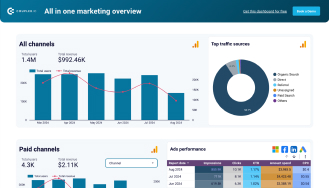
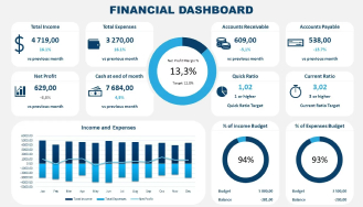
Take a look at these prime Power BI use cases we've crafted for our industry CTOs. These BI examples helped them simplify their operational decisions!
HealthTech
View Demo
Custom
LegalTech
View Demo
Custom
FinTech
View Demo
Custom
2. Full Screen for PBIX and RDL Viewing
What's it for? - Support for Full-Screen Viewing of PBIX and RDL Files
Think of this as switching from a small TV to a home theatre. With the full-screen mode, you get a clutter-free, immersive view of your PBIX and RDL reports.
No Distractions: Focus only on your data.
Bigger, Better Insights: Analyze data without switching tabs.
Ideal for Presentations: Perfect for meetings where you need undivided attention.
Whether you’re showcasing reports in a boardroom or analyzing them solo, full-screen viewing takes your experience to the next level.
Optimize your workforce! Get your HR analytics dashboard
Contact now
3. Mobile Layout Switcher
What's it for? - Ability to Switch Between Different Mobile Layouts
Why settle for a one-size-fits-all approach? Power BI now lets you switch between different mobile layouts with ease.
Grid View or Tabular? Choose the layout that suits your analysis.
Custom Layouts: Design layouts for different devices.
Quick Toggle Option: Instantly switch between views for better insights.
This makes it easier to tailor reports for your mobile audience.
4. Shapefile Support in Azure Maps Visual
What's it for? - Expansion of Spatial Data Integration
Imagine trying to map out delivery routes without showing exact boundaries — confusing, right? Now, Shapefile support in Azure Maps Visual solves that.
Better Geospatial Analysis: Plot locations with accurate boundaries.
Custom Map Layers: Add region-specific boundaries for better insights.
Ideal for Logistics and Supply Chain Reports: Map routes, coverage areas, and more.
This feature helps you make location-based decisions with precision.
Read More: HR Analytics Dashboard – Key Metrics & Examples
5. Data Bars in Matrix Subtotal/Total Conditional Formatting
What's it for? -Enhanced Data Visualization in Matrices
Ever looked at a matrix and felt lost in the numbers? Data bars make it visually easy to compare totals across rows and columns.
Intuitive Visuals: See trends and outliers instantly.
Conditional Formatting: Highlight key values automatically.
Enhanced Readability: Turn numbers into easy-to-interpret visuals.
It’s like adding color to a black-and-white photo — you spot the highlights faster!
6. 100% Stacked Area Chart
What's it for? -New Visual for Better Data Representation
Think of this as pie charts meeting line graphs! The 100% stacked area chart gives you a clean way to show percentage trends over time.
Clear Trend Visualization: Easy to spot changes across categories.
Great for Market Share Analysis: See how each segment evolves.
User-Friendly: Perfect for tracking percentages without confusion.
This chart makes percentage-based data easier to interpret visually.
Unlock your business potential with our Power Platform consulting services
Get in touch
7. Enhanced Q&A with Copilot-Generated Linguistic Relationships
What's it for? -Improved Natural Language Processing for Q&A
Ever had that one friend who knows all the answers? Now, Power BI’s Q&A does that with Copilot-generated linguistic relationships.
Smarter Responses: Understands complex questions better.
More Accurate Insights: Delivers the right answers faster.
Enhanced User Experience: Type your question and get precise answers.
It's like talking to an assistant who always knows what you're looking for!
8. Certified Connectors Updates
What's it for? -Updates to Certified Data Connectors
Picture this — you’re plugging in your charger, and it fits perfectly every time. That’s what certified connectors in Power BI do for your data.
Seamless Integration: Connect with updated, verified connectors.
Improved Security: Certified for compliance and reliability.
Expanded Options: More choices for connecting to various platforms.
These updates ensure smoother and safer data connections.
Read More: 10 Executive Dashboard Examples for Consultants and CEOs
9. Dynamic Format Strings for Measures
What's it for? -General Availability of Dynamic Format Strings
Ever wished your report could adapt its format automatically? Dynamic format strings do just that!
Flexible Formatting: Switch between formats dynamically.
Better Contextual Reporting: Show numbers as currency, percentages, or plain values.
Ideal for Multi-Region Reports: Adapt formats based on user preferences.
No more static formats — let Power BI adjust on the fly!
10. New INFO.VIEW Data Analysis Expressions (DAX) Functions
What's it for? –Introduction of New DAX Functions.
Think of these new DAX functions as adding new spices to your kitchen. They bring more flexibility and control to your data analysis.
Enhanced Data Exploration: Quickly access key insights.
Improved Query Efficiency: Process data with fewer steps.
More Control Over Data Models: Gain better control over complex data sets.
These DAX updates make working with data smoother and faster.
Check your sales performance with our custom Sales dashboard development !
Get in touch
11. Performance Improvements for Models with Calculation Groups
What's it for? –Enhanced Performance for Complex Models.
Have you ever felt your model slowing down with too many calculations? Power BI now boosts performance for models using calculation groups.
Faster Processing: Handle complex models without lag.
Improved Scalability: Ideal for large enterprise-level datasets.
Better Memory Management: Optimized for high-efficiency processing.
Now, even the most complex models perform smoothly.
12. New Visuals in AppSource
What's it for? -Addition of New Visuals Like Date Picker, Cycle Plot, and Decomposition Tree.
Imagine adding fresh tools to your toolbox — that’s what these new visuals in AppSource do for your reports.
Date Picker: Simplifies time-based filtering.
Cycle Plot: Reveals seasonality in data.
Decomposition Tree: Breaks down complex hierarchies visually.
These visuals offer more ways to make your reports insightful and engaging.
Our Power BI Templates
(Turning insights into various data visualizations)
Step Area Chart
Our Step Chart visualization built with Power BI provides a simple way to grasp complex time-related data, enabling faster, data-driven decision-making.
Why is it worth using?
Helps identify trends 40% more accurately.
Cuts analysis time by 25%.
Highly customizable.
Popular among over 250,000 professionals.
Speeds up data-driven decisions in Fortune 500 companies.
View Live Demo
Pie Chart
This personalized pie chart brings data to life with labeled sections, vibrant colors, and interactive tooltips. Click on slices to explore details and filter insights effortlessly!
Why is it worth using?
Clear category representation.
Adaptable dynamic data.
Highly customizable.
Highlighting specific data points.
40% trend identification improvement.
25% analysis time reduction.
View Live Demo
Bump Chart
Track ranking changes over time with our Bump Chart for Power BI. Gain clear insights into performance dynamics and compare entities effortlessly!
Why is it worth using?
Gain clarity on performance shifts over time.
Customized colors, and tooltips to fit your needs.
Ideal for data analysts, business leaders, and financial planners.
Make smarter decisions with trend insights.
Track rankings effortlessly for action.
View Live Demo
13. Power BI Mobile Apps Update
What's it for? -Mobile Apps Will No Longer Connect to Report Server Using OAuth and AD FS 2016.
Wondering if your mobile app will still work after this update? Here’s the catch — Power BI mobile apps will no longer use OAuth and AD FS 2016 for connecting to Report Server.
Why the Change? To improve security and connectivity.
What You Need to Do: Reconfigure connections to comply with the new standards.
Future-Proofing Security: Ensures safer mobile access to reports.
Read More: How to Export Power BI Data to Excel
Elements of Power BI Report Server
The following are the key elements of the Power BI Report Server:
1. Web Portal:
Think of this as a central hub where you can access all your reports. It's like a website where you can view, manage, and organize your reports easily.
2. Power BI Reports:
These are interactive reports that let you explore data visually. You can click on different parts of the report to see more details, filter information, and get insights quickly.
3. Paginated Reports:
These are traditional, print-ready reports that are designed to fit well on a page. They are great for creating detailed, formatted documents like invoices or financial statements.
4. Mobile Reports:
These reports are optimized for viewing on mobile devices like smartphones and tablets. They ensure that you can access your important data and insights on the go, with a layout that looks good on smaller screens.
So, that's all for this overview of Power BI features and elements. We hope you found it inspiring and helpful.
If you need assistance in custom dashboard development, require any Power BI licenses with offers, or need support in Power BI performance tuning, our data analytic experts are here to help you at every step of the way. Connect with iFour and hire Power BI developers.
Stay tuned for more tips and tricks on using Microsoft Power BI and report automation.
Power BI report server latest version - Summary
To wrap things up, Power BI Report Server is a great tool for displaying reports and managing KPIs through an easy-to-use web portal. You can start with a free trial, but to keep enjoying all its premium features, you'll need a Power BI Premium License or SQL Server Enterprise with Software Assurance.
Here are the key points to remember about Power BI Report Server:
It’s an on-premises solution for Power BI Reporting services.
You’ll need a Power BI Premium license to use it.
You can host both SSRS (.rdl) and Power BI (.pbix) reports.
It combines the best of Power BI and SSRS in one place.
It helps you transition from traditional SSRS to the more dynamic Power BI.
FAQs on Power BI Report Server
1. Is Power BI Report Server free?
Nope, it's not free. You can start with a free trial, but you'll need a Power BI Premium License or SQL Server Enterprise with Software Assurance to keep using it. Learn more from here.
2. What is the difference between Power BI Report Server and Desktop?
Power BI Report Server is for hosting and sharing reports on-premises, while Power BI Desktop is for creating those reports on your computer. Desktop is free, but Report Server needs a license. Learn more about Power BI Report server vs Power BI Desktop here
3. Is the Power BI Report Server part of SQL Server?
Kind of. You can use it with SQL Server Enterprise with Software Assurance, but it's not included by default. It needs its own setup.
4. What is the pricing for Power BI Report Server?
Pricing varies. You need a Power BI Premium License (starting at $20 per user/month) or SQL Server Enterprise with Software Assurance. Exact costs depend on your setup.
5. What is the difference between Power BI Report Server and Power BI Service?
Power BI Report Server is for on-premises use, keeping data and reports in-house. Power BI Service is cloud-based, offering more features like dashboards and real-time data. Learn in detail on the Power BI report server vs Power BI service here.
Vinod Satapara
A technocrat and entrepreneur of iFour Technolab Pvt. Ltd. with extensive experience in building enterprise web, cloud, and mobile applications using ASP.NET, CORE, .NET MVC, Angular, and Blockchain. Passionate about addressing business problems through innovative technologies, Vinod is also an avid reader, enjoys exploring new tech trends, and loves traveling in his spare time.
Selecting the right project management software helps you complete tasks on time with accuracy. Whether your team has five people or five hundred, choosing the right solution is essential...
AI agents are everywhere these days.
The world's biggest tech players - Microsoft, Alphabet, Amazon, and Meta are investing heavily in AI infrastructure, with spending expected...
You already know how healthcare creates tons of clinical data every day. Patient visits… Labs… EMRs… doctor portals… scheduling systems… everything is generating numbers nonstop.
But...