8 Powerful Data Storytelling Examples for CTOs
Data isn’t just numbers - it’s a goldmine of insights waiting to be uncovered. Data storytelling is something that assists you in transforming your business. Given below are some of the best examples of Data storytelling:
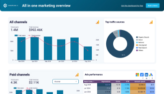
Example 1: Predicting Future Trends with Dashboards
Imagine having a crystal ball for your business. Predictive analytics dashboards play a pivotal role in data-driven decision-making. It actually acts as a crystal ball for your ongoing business. Tools like Power BI and Tableau analyze past data to uncover emerging trends.
What’s the impact? Strategic planning becomes a breeze. You’ll allocate resources smarter, invest wisely, and stay ahead of the competition. It’s data analytics for C-level executives, made actionable.
Image source
Want more data storytelling examples? Explore our Free templates to help you drive your decisions.
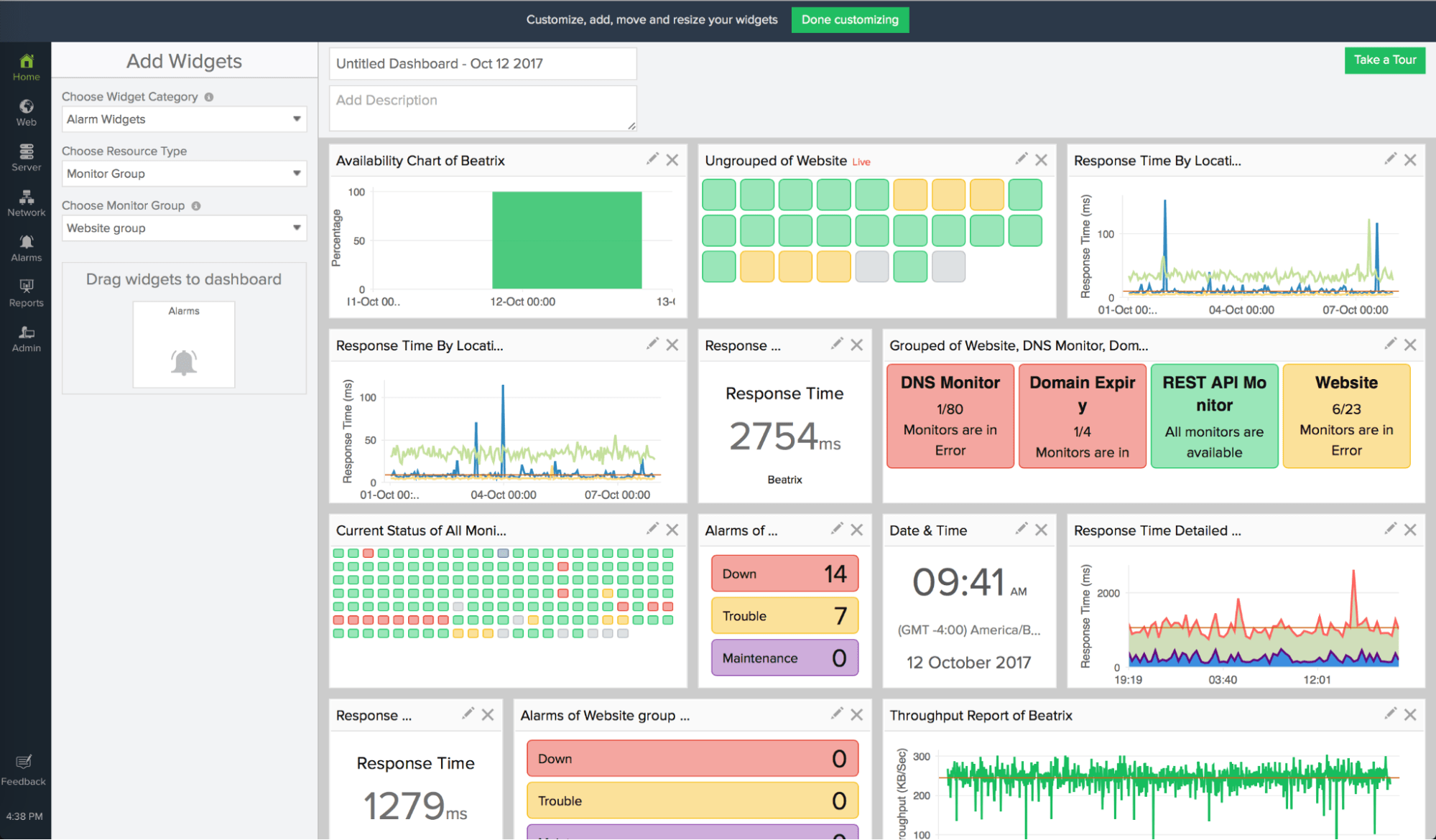
Example 2: Visualizing IT Infrastructure Performance
Now, how do you keep your IT systems running smoothly? Interactive dashboards are the answer. Right? Data Storytelling Tools like Splunk and Grafana give you real-time insights into system uptime, latency, and overall efficiency.
With data visualization tools for IT, you can detect issues the moment they arise and optimize performance before they become problems. It’s data storytelling in IT that drives action and keeps operations seamless.
Image source
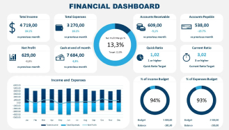
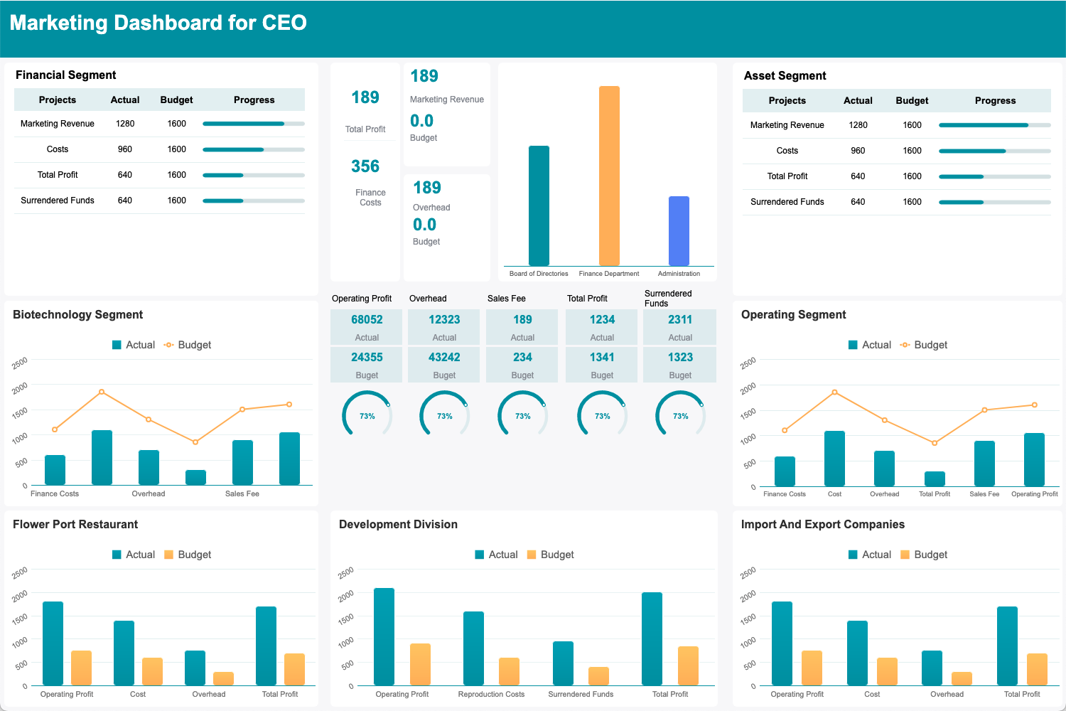
Example 3: Budget Allocation Insights for IT Projects
Another best example of Data storytelling is the Financial BI dashboard which helps you balance IT project budgets easily and effectively.
Tools like Excel with Power Query and Power BI give you a clear view of ROI, expenses, and cost allocation.
With this data-driven decision-making approach, you can allocate resources effectively and ensure every dollar is spent strategically. Isn’t that the clarity your projects deserve?
Image source
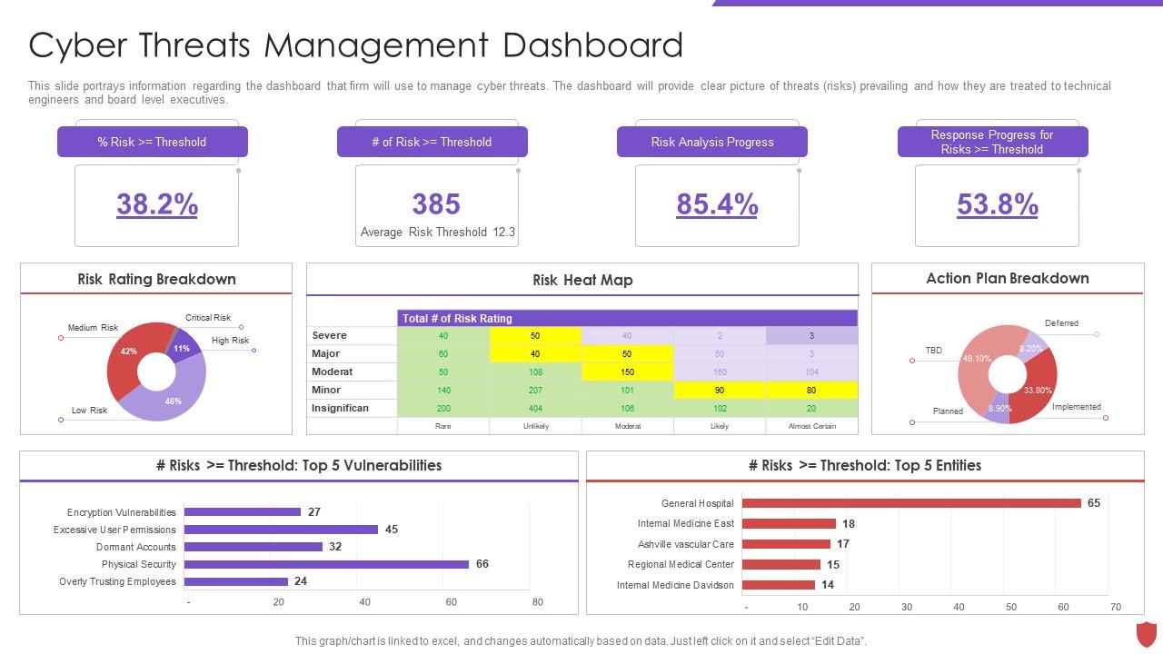
Example 4: Cybersecurity Metrics for Risk Mitigation
Cyber threats are evolving, but so are the solutions. Heatmaps and charts, powered by Power BI and Kibana, visualize vulnerabilities and track threats in real time.
This isn’t just about monitoring—it’s about proactive protection. With the right data storytelling techniques, you’ll turn raw data into actionable insights, safeguarding your IT infrastructure from risks.
Whether you’re looking at MS Fabric or Power BI or some other advanced data storytelling tools, it’s all about making data work for you.
Image source
Example 5: Employee Productivity Analytics
How can you ensure your teams are performing at their best? By tracking KPIs with data visualization for CTOs. Tools like Fabric, Tableau, Google Data Studio, and Power BI for CTOs let you dive deep into department or team efficiency.
The result? Clear insights into workforce productivity and areas that need attention. With data storytelling techniques, you can focus on optimizing operations without getting bogged down in spreadsheets.
Image source
Example 6: Tracking Product Development Lifecycle
Are development delays slowing you down? Data storytelling in IT solves that. Tools like Jira and Confluence integrations use timeline charts to track progress, identify blockers, and highlight delivery milestones.
By streamlining processes, you’ll ensure faster, more efficient product rollouts. That’s how your data-driven decision-making made practical using this storytelling technique.
Example 7: Data Consolidation Across Business Units
Siloed data holding you back? Imagine having a single source of truth for your entire organization. Tools like Snowflake and data visualization tools for IT like Power BI make it possible.
With unified visuals, you can foster cross-departmental collaboration and make decisions that benefit the entire business. Isn’t it time to break down those data walls?
Image source
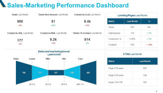
Example 8: Customer Behavior and Revenue Analytics
Want to refine your customer acquisition strategies? Data storytelling techniques with tools like Tableau and Looker let you segment customers and uncover revenue patterns.
By visualizing customer behavior, you’ll boost retention, target the right audience, and drive revenue. It’s storytelling that delivers real results for your bottom line.
Image source
Best Practices for Data Storytelling in IT Leadership
Want to make your data stories stick? It’s not just about the numbers; it’s about the narrative. Start with your audience. What do they care about?
Simplify the complex—turn data into visuals that even non-tech individuals can understand. Think charts, graphs, and clear dashboards. And don’t forget consistency.
Does your data tell the same story across all teams? If not, you’ll lose trust. Contact iFour to get appealing Dashboard development services personalized to your requirements.


